Ideas
Gallery Wall Layout Ideas for Every Room — Living Room, Hallway, Staircase
The same photos can look considered in one room and chaotic in another. Here's which gallery wall layout suits the living room, hallway, staircase, bedroom, nursery and small walls — and how to match the shape to your own photos.
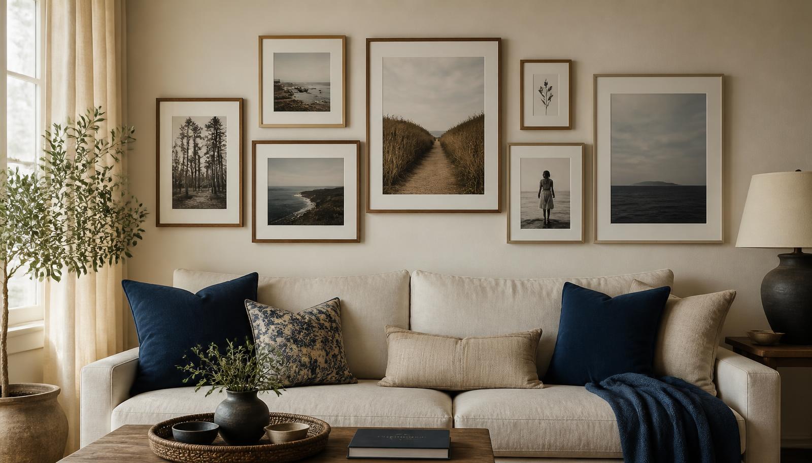
The same set of photos can look considered in one room and chaotic in another. The reason is rarely the photos — it's that each wall has a shape, a viewing distance, and a piece of furniture under it that the layout has to answer to. A grid that anchors a living room can feel stiff climbing a staircase; a line that suits a hallway can look thin above a sofa.
Here's which layout suits each room, and why — so you can match the arrangement to the wall instead of forcing one shape everywhere.
Living room: anchor above the sofa
The living room wall is usually the biggest and the most seen, so it can carry the most photos. Above a sofa or console, the arrangement should span roughly two-thirds of the furniture's width and sit as one balanced block — not drift off to one side.
- Best layouts: a centered salon arrangement, a loose grid, or a large mosaic. All of them reward mixed sizes and a clear focal photo.
- Spacing and height: two to three inches (5–8 cm) between frames; leave 15–25 cm (6–10 in) of breathing room above the sofa back.
- Tip: give one photo real size — a wide landscape or a portrait that carries the room — so the eye has somewhere to land. All-equal frames read as flat on a big wall.
Hallway: a level line at eye height
A hallway is seen up close and in passing, so it wants order over drama. Frames kept to the same height and evenly spaced read as intentional the moment you walk through.
- Best layouts: a single horizontal line, or a two-row band running the length of the wall.
- Spacing and height: center the line around 145–150 cm (57–60 in) from the floor; keep the gap tight and consistent since you see it at close range.
- Tip: a hallway is a good place for a themed run — one trip, one year, one person's photos in sequence — because people move along it and read it left to right.
Staircase: follow the slope
The staircase is the layout most people get wrong, because the reference line isn't the floor — it's the diagonal of the handrail. Frames should step up in parallel with the stairs, keeping a consistent distance above the treads.
- Best layouts: a staggered ascending line, or a loose column that climbs with the rail.
- Spacing and height: measure each frame's height from the step below it, not from the floor, so the arrangement rises evenly.
- Tip: mix portrait and landscape as you climb to keep the rhythm lively, but hold the top or bottom edge of the run roughly parallel to the rail so it reads as deliberate.
Bedroom: calm and symmetrical
A bedroom wall — usually above the headboard — is seen from across the room and from the bed, so it rewards symmetry and a softer, quieter set of images.
- Best layouts: a symmetrical grid, a pair of columns flanking the bed, or a low salon centered on the headboard.
- Spacing and height: center above the headboard, spanning about the width of the bed; keep the bottom frames high enough to clear pillows and a sitting head.
- Tip: picture ledges work well here — you can lean and swap frames without new holes, handy in a room whose mood you change often.
Nursery and kids' rooms: ledges, not nails
Children's rooms change fast, and so do the photos you want up. A layout you can edit without re-drilling is worth more than a perfect fixed grid.
- Best layouts: two or three picture ledges, or a small flexible cluster.
- Tip: ledges let you rotate photos as the child grows and swap art in seconds. Keep everything above reach height for younger children.
Home office and stairwell landings: small, sharp clusters
Small or transitional walls — beside a desk, on a landing, in a reading nook — don't need many frames. A tight cluster of three to six looks finished with almost no planning.
- Best layouts: a quad, a pinwheel, or a short line of three.
- Tip: these are the lowest-risk walls to start with if a big gallery feels daunting — quick to plan, quick to hang, and easy to get right.
How to match a layout to your photos, not just the room
The room tells you the shape; your photos tell you the details. Two steps make the match:
1. Sort by orientation. Count how many portrait, landscape, and square photos you have. A mostly-portrait set climbs a staircase beautifully but fights a wide living-room grid. Let the mix steer the shape. 2. See it at true scale before you drill. A layout that looks balanced on a screen can feel cramped or lost full-size on the wall. Tape paper cutouts up, or preview it digitally at real dimensions, and live with it for a day before committing.
Let the layout build itself
Matching a shape to every wall, sizing for a focal point, holding even spacing, then measuring it all onto the wall — it's simple to describe and slow to do by hand, which is why so many rooms stay bare.
This is the part Once Upon A Home handles. You upload your photos and its AI arranges a layout built around your exact count and orientation mix — then shows it true-to-scale on the specific wall you're planning, whether that's above the sofa or climbing the stairs. When it looks right, you export a hanging guide with nail coordinates and a 1:1 stencil, tape it up, and drill through the marks. You order your own prints and frames; the matching and the measuring are done for you.